Case Study: Radar Pictures
Modernizing Radar's Web Presence

Chris Leja, Software Engineer
Nov. 18, 2021
Radar Pictures is an independent media studio that was formed at Interscope Communications in 1984 and has produced over 80 beloved movies and series, including The Jumanji Franchise and Bill & Ted’s Excellent Adventure. Radar is also producing Amazon’s highly anticipated TV series adaptation of Robert Jordan’s best selling fantasy series .
The Challenge
Radar’s site didn’t reflect the modern face of the company. Their site was heavily reliant on the now-defunct Adobe Flash Player, had poor SEO, and long load times for content. Worse, the design was non-responsive, which made the site effectively unusable on mobile devices.
Given that mobile web traffic currently comprises over 56% of all web usage, the site’s failure to accommodate mobile devices immediately alienated the majority of likely visitors. It desperately needed to be overhauled for modern audiences.
To help realize their growth goals and better support the launch of their new Music, Live Theatre, Documentary, and Podcast divisions, Radar needed a modern web presence.
Our Strategy
To properly modernize Radar’s brand and web-presence, we had to address two key challenges. First, we had to overhaul the design, layout, and navigation of the site to prioritize mobile users and the clear delivery of content. Second, we had to optimize performance to reduce page load speeds on all devices, ensure the site was easily maintainable, and improve SEO.
We worked with Radar and Felipe to create a new design system to modernize the appearance of the website. Our priorities for this design system were to:
Emphasize the mobile experience. Offering a responsive layout for mobile is essential for modern users, and we ensured there would be no disruption of content on any screen size.
Avoid wasted space. Whereas the previous site clustered all the content in the corner, our new design emphasized using the full page on all screen sizes to more efficiently guide the user’s eyes.
Focus on visual clarity and intuitive navigation for all screens. The content had to be effortlessly accessible on any screen size.
To optimize the site’s performance and ease of maintenance, our strategy was based on a few key decisions:
Utilize Gatsby to optimize browser-caching and retrieval of static assets. This offered immediate performance benefits and also helped improve SEO.
Emphasize SEO. Given that analytics data shows most users discovered the site organically, we used best practices to ensure the site was easily accessible.
Optimize performance at every stage. Since Radar’s site revolves around large image and video assets, improving page load speeds was a top priority--to achieve this, we leveraged lazy loading, dynamically resized images and videos, and incorporated browser caching.
Prioritize maintainability for the client. We incorporated Contentful to allow Radar to continue integrating new content on the site with a minimal barrier to entry.
The Result


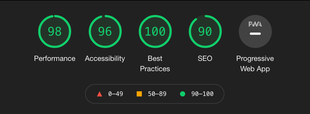
- Google Lighthouse reports from before and after our rebuild.
The revamped website offered a night and day difference across the board. Our new site is nearly perfect in every category—per Google’s Lighthouse reports, out of a possible 100, our new site earned a score of:
98 for total performance (a 41 point increase)
90 for SEO (a 40 point improvement)
100 for best practices (a 53 point boost)
96 for accessibility (a 35 point gain)
There is more to building a modern website than simply performance, though. On a purely visual level, Radar’s new site is elegant and visually clear, seamlessly integrating a wide range of image and video content. The updated navigation and layout offers a more welcoming user experience, ensuring content is easily accessible to all visitors.
The mobile experience illustrates this best. Here is a side by side comparison (on an iPhone X) of navigating from the home page to getting information about the latest featured release.